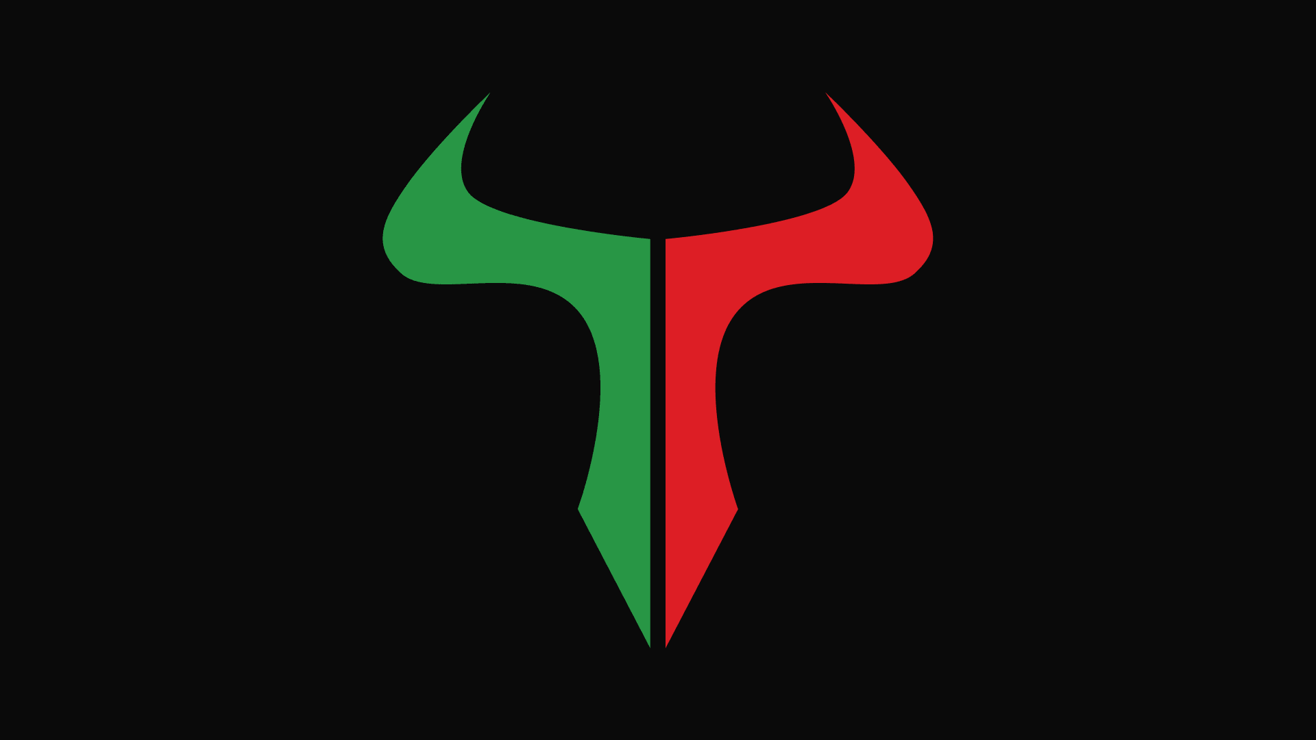
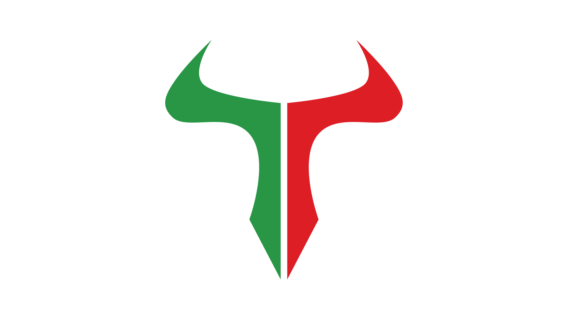
Fintech Trading Icon
Brand Identity and Logo Design for an Unnamed Fintech Client
Project Overview
An emerging fintech startup in the trading space required a distinctive mark that communicated both financial strength and market dynamics. Since they only needed an icon to start, no name is attached yet. They provided a reference logo and a candlestick chart, requesting a dual-split design with half red and half green to mirror market movements inside the shape of a bull.
!The Challenge
Executing the client's specific vision (a red/green split bull based on candlestick charts) while ensuring the mark remained modern, scalable, and professional.
✓The Solution
A dual-color conceptual logo that embeds the market 'up/down' metaphor directly into the symbol, refined across several iterations.
Design Approach
The process involved taking the client's candlestick chart reference and translating that red/green binary into the structural anatomy of the bull logo.
Role
Graphic and UI/UX Designer
Timeline
4 Months
Tools
Figma, Canva
Deliverables
- • Conceptual Logo Design
- • Dual-color Mark
- • Brand Iconography
Visual Artifacts
A comprehensive collection of the design deliverables.
Client References
The reference logo and candlestick chart provided by the client, requesting a dual-split design (half red, half green).

Logo in Red - Reference Provided by Client
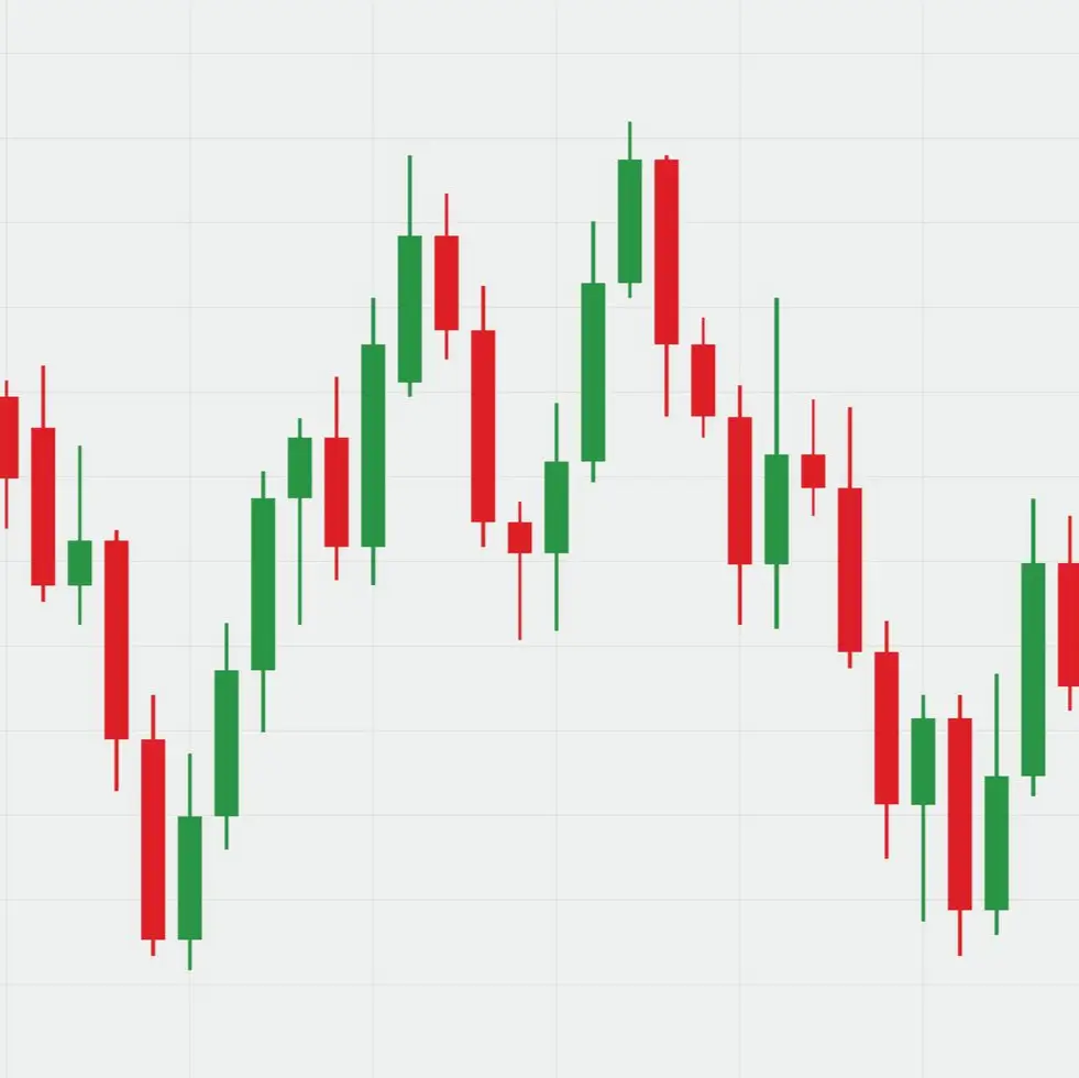
Candlestick Chart
Logo Concepts
Exploration of the bull shape and color integration.



Selected Logo Direction
The final dual-color mark in various backgrounds.