Fintech Trading Icon
The Brief
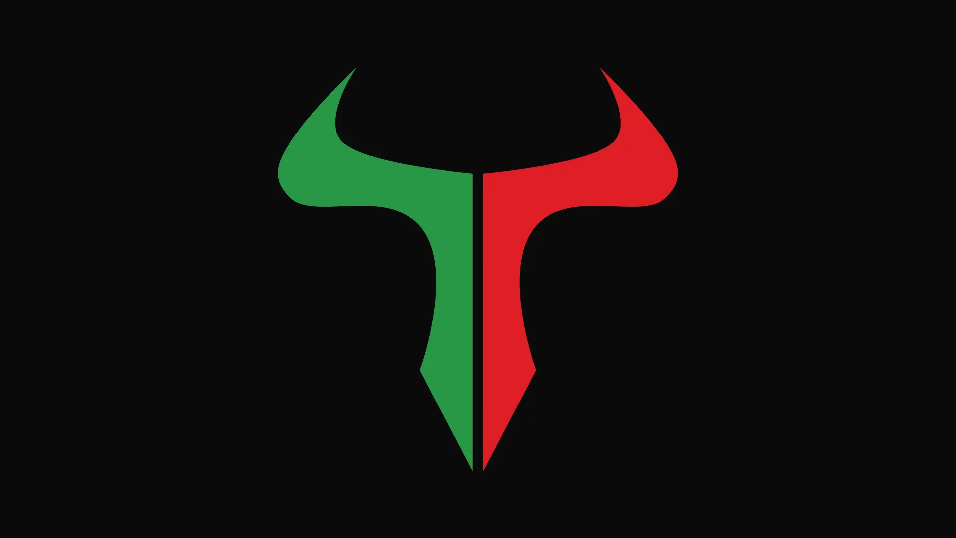
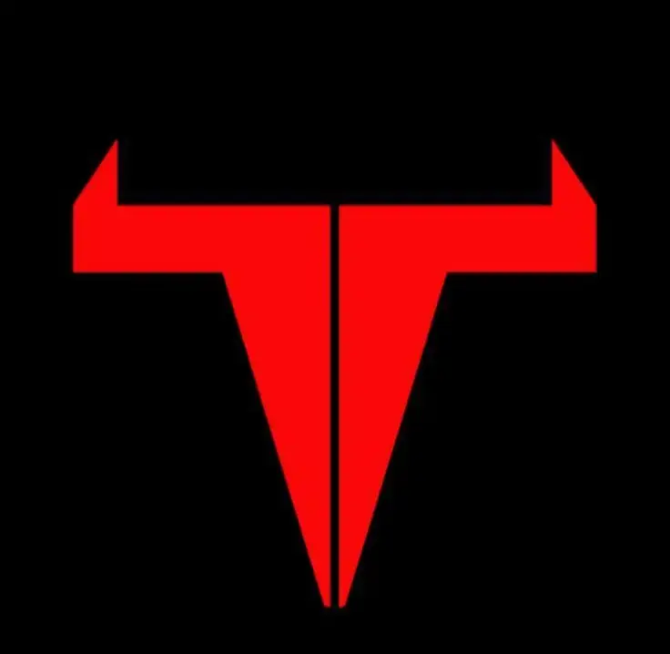
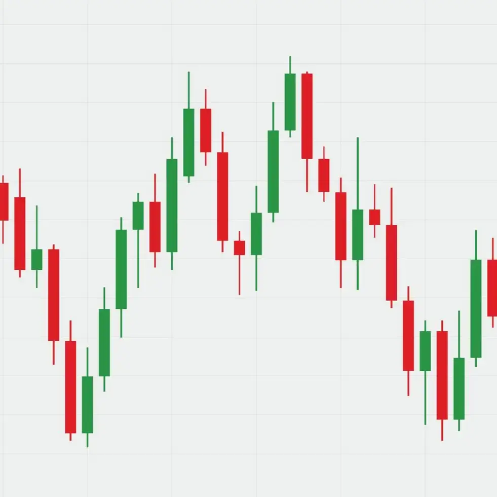
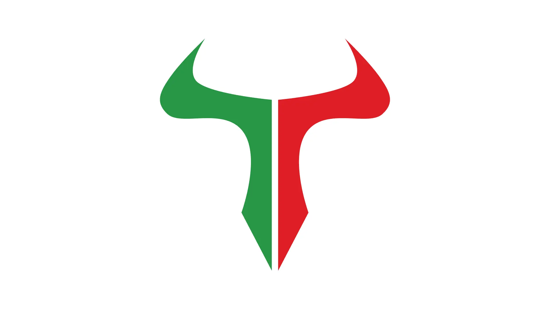
An emerging fintech startup in the trading space required a distinctive mark communicating financial strength and market dynamics. Given a reference logo and a candlestick chart, the request was to design a dual-split icon - half red, half green - to mirror market movements embodied within the shape of a bull.
Process & Exploration
Client References & Synthesis
Analyzed the provided candlestick charts to translate the red/green binary nature of the markets into a structural form.
Logo Concepts
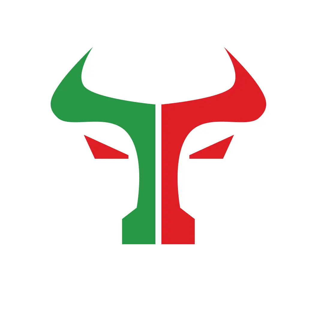
Explored the anatomy of the bull, iteratively testing how color integration could seamlessly merge with the animal's powerful shape.


Selected Logo Direction
Finalized a conceptual, dual-color mark that embeds the market's 'up/down' metaphor directly into a modern, scalable, and professional symbol.
Outcome & Impact
Delivered a visually striking icon that captured the essence of market volatility and strength, ready for scaling into a complete brand identity.